Colour Yourself Confident: Why Clothing Colour Matters for Personal Branding Photos

Choosing the right clothing colour is an important consideration when taking personal branding photos because it can have a significant impact on how you are perceived by your target audience. Here are some reasons why clothing colour matters for branding imagery:
Colour can evoke emotions:
Colours can have a powerful effect on our emotions and can communicate certain qualities or characteristics. For example, blue can convey professionalism, trustworthiness, loyalty and calmness, while red can convey energy, passion, determination and power. When selecting clothing colours for personal branding photos, it's important to consider the emotions you want to evoke and the message you want to communicate.
Colour can enhance your features:
Certain colours can complement your skin tone, eye colour, and hair colour, making you look more attractive and polished in your photos. For example, if you have blue eyes, wearing clothing in shades of blue can make your eyes pop and draw attention to your face.
Colour can help you stand out:
Choosing a bold, eye-catching colour can help you stand out from the crowd and make a memorable impression. It's important to be mindful of your industry, your brand message and the image you want to project.
Colour can Set the Tone:
The colour of your clothing can set the tone for your photoshoot. For example, if you're going for a more serious, professional look, neutral colours like black, gray, or navy may be appropriate. If you want a more playful, fun vibe, brighter colours may be more appropriate.
Colour can reinforce your brand identity:
Your clothing colour choices should align with your brand identity and the message you want to convey. For example, if you run a fitness brand, wearing athletic wear in bright, bold colours can reinforce your brand identity and communicate a sense of energy and vitality. If you already have an established brand with specific colours and style guidelines, it's important to incorporate those colours into your photoshoot to maintain consistency and reinforce brand recognition.


Prior to exploring the meanings and associations of various colours, it may be helpful to first create a list of words that you would like others to associate with you and your brand.
Different colours have different meanings and associations. Here are some of the most common colours and their meanings:
Red: Exciting, passionate, powerful, strong, elegant, dramatic, determined.
Orange: Enthusiasm, youthfulness, courage, confidence, friendliness, optimism, energy, creativity.
Yellow: Cheerful, energetic, joyful, spontaneous, friendly, warm, happy, innovative, perky.
Green: Peaceful, stable, harmonious, wealthy, youthful, reliable, natural, soothing, balanced.
Blue: Trustworthy, loyal, integrity, intelligent, strong, calm, reliable, wise.
Purple: Luxury, ambition, spirituality, sentimentality, romance, regality, creativity, intuition.
Black: Powerful, elegant, sophisticated, mysterious, luxurious, timeless, classic.
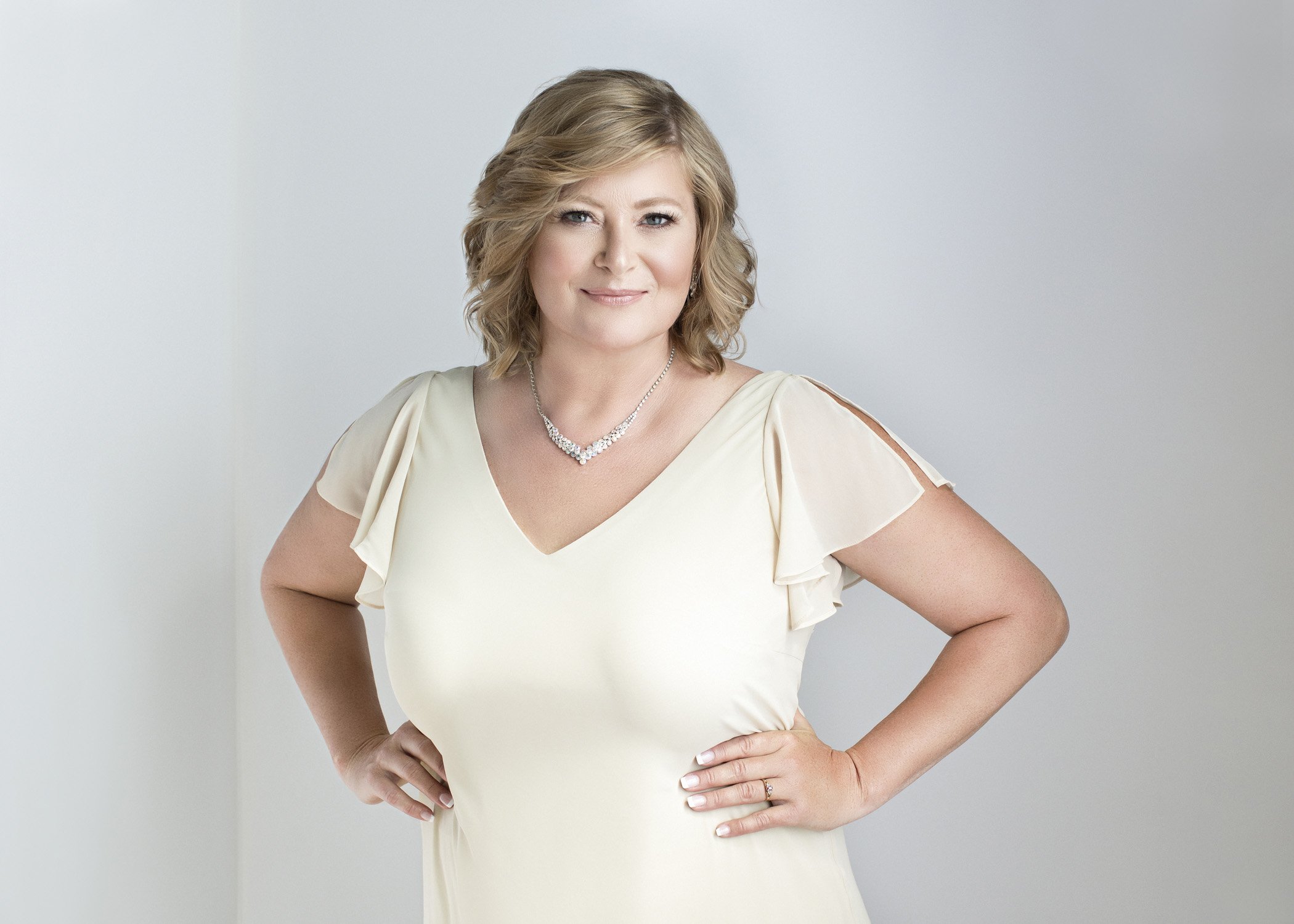
White: Purity, innocence, cleanliness, simplicity, luxury, freshness, modernity.
Gray: Neutrality, balance, professionalism.
Nudes: Warm, approachable, current.
Neutrals: They are typically shades that do not have strong chromatic qualities, such as black, white, gray, beige, and taupe. Neutral colours are often used to create a sense of balance and harmony, and can be paired with bolder hues to create contrast. Neutral colours are also versatile and timeless, making them a popular choice in fashion, home decor, and graphic design. They can be associated with qualities such as neutrality, professionalism, and understated elegance.
Bright Colours: These colours are bold, vibrant, and eye-catching hues that are intense and vivid. They are often used to create a sense of energy, excitement, and enthusiasm. Some common bright colours include electric blue, hot pink, sunny yellow, and fiery red. Bright colours can be associated with a range of positive qualities, such as leadership, confidence, and exuberance. They are commonly used in advertising, fashion, and graphic design to create a strong visual impact and to draw attention to a product or message.
Pastels: A group of light, muted shades including pale pink, baby blue, soft lavender, light yellow, and mint green. Pastel colours are often associated with a range of positive qualities, including friendliness, approachability, and warmth. They can also evoke a sense of nostalgia and innocence. Pastel colours are commonly used to create a gentle, calming, and feminine atmosphere.
Jewel Tones: Jewel tones are colours that are rich, vibrant, and saturated, similar to the hues found in precious gems such as emerald green, sapphire blue, ruby red, and amethyst purple. Jewel tones can evoke a sense of luxury, elegance, and drama, and are often used in fashion and home decor to add a pop of colour and sophistication.

If you choose to wear all one colour, whether it be a bright and bold hue or a nude tone, incorporating multiple textures in the same colour can make your photos more visually interesting and help them stand out from others.
In summary, choosing the right clothing colour for personal branding photos can help you communicate your message effectively, enhance your features, and reinforce your brand identity and recognition.
For more information and how to book your consultation session email us at sara@sarakardooni.com